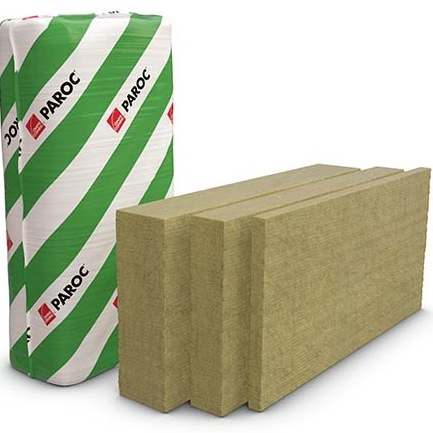
PreheadXL Size with Image
XL Size with Image
Lorem ipsum dolor sit amet consectetur adipisicing elit. Voluptatibus facere laborum vel earum placeat tempora dolorem doloribus.
Tier 3 Standard Heading
More content can go here
More content can go here
More content can go here
More content can go here
More content can go here
More content can go here
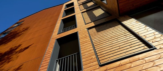
XL Size with Image
Lorem ipsum dolor sit amet consectetur adipisicing elit. Voluptatibus facere laborum vel earum placeat tempora dolorem doloribus.
H2 Heading Style (Oswald) Also Red
Basic content is a module that is embedded in just about every other item. It's a basic layout that includes a Prehead, Heading, body copy, and up to two CTAs. It can be used on its own (as shown here) or within other modules (e.g. before a group of block links, cards, etc.).
The body copy element also supports a variety of text styles. Simple things like bold and italics, hyperlinks and also various heading styles as shown below.
Other text styles like bold and italic or superscript and subscript or even red text mixed with bold, italic, superscript or subscript is here. You can also add an internal link and external link and below is a document link (DMS)
Block links are used as navigation items, typically to represent a group of related items (e.g. product types or features). As they are links, they will always need to link to a new page or a document.
Block links allow a variety of layouts - mimimums and maximums are shown below.
Additionally, an optional CTA can be used (typically in the event that a link to view "all" items (e.g. "View All)
Cards are similar to block links in the sense that they are used to display a group of related items, but have a bit more flexibility including:
Here is brief body copy that can also be paired with a caard to convey a bit more detail on the item above.
Here is brief body copy that can also be paired with a caard to convey a bit more detail on the item above.
Here is brief body copy that can also be paired with a caard to convey a bit more detail on the item above.
Here is brief body copy that can also be paired with a caard to convey a bit more detail on the item above.
Here is brief body copy that can also be paired with a card to convey a bit more detail about the item above.
Here is brief body copy that can also be paired with a card to convey a bit more detail about the item above.
Here is brief body copy that can also be paired with a card to convey a bit more detail about the item above.
Here is brief body copy that can also be paired with a card to convey a bit more detail about the item above.
Here is brief body copy that can also be paired with a card to convey a bit more detail about the item above.
Here is brief body copy that can also be paired with a card to convey a bit more detail about the item above.
Here is brief body copy that can also be paired with a card to convey a bit more detail about the item above.
Here is brief body copy that can also be paired with a card to convey a bit more detail about the item above.
Here is brief body copy that can also be paired with a card to convey a bit more detail about the item above.
The category feature needs to utilize a data set for this to be able to show its full potential. Until there is a published, usable Paroc data set, this will show blank. Please see module documentation for further information on the Category Feature.
The contact us module allows you to either input pre-defined contact details (label, body copy, phone, email, and/or form) or create custom.
The contact us module is typically only used at the bottom of the page (ahead of the footer)
The content and image module contains fields for content (the basic content construct, as indicated above - with headings, body and CTAs) and space for some sort of media (image or video). Module has a variety of different layouts that affect size and position of image/copy.
Content & Image:
XL Size,
1/3 Text, 2/3 Media
This is the body copy. Typically, we use this section to help reinforce whatever the image is showing - be it a product, feature or service. Content & Image modules are used all over the website. In all of these, the image sizes are directional. Images will always scale to fit the width of the container, but can be taller or shorter than what is currently displayed.

Content & Image:
XL Size,
1/3 Text, 2/3 Media
This is the body copy. Typically, we use this section to help reinforce whatever the image is showing - be it a product, feature or service. Content & Image modules are used all over the website. In all of these, the image sizes are directional. Images will always scale to fit the width of the container, but can be taller or shorter than what is currently displayed.
Content & Image:
XL Size, Video,
1/3 Text, 2/3 Media
This is the body copy. Typically, we use this section to help reinforce whatever the image is showing - be it a product, feature or service. Content & Image modules are used all over the website. In all of these, the image sizes are directional. Images will always scale to fit the width of the container, but can be taller or shorter than what is currently displayed.
Content & Image:
XL Size,
1/2 Text, 1/2 Media
This is the body copy. Typically, we use this section to help reinforce whatever the image is showing - be it a product, feature or service. Content & Image modules are used all over the website. In all of these, the image sizes are directional. Images will always scale to fit the width of the container, but can be taller or shorter than what is currently displayed.
Content & Image:
XL Size,
2/3Text, 1/3 Media
This is the body copy. Typically, we use this section to help reinforce whatever the image is showing - be it a product, feature or service. Content & Image modules are used all over the website. In all of these, the image sizes are directional. Images will always scale to fit the width of the container, but can be taller or shorter than what is currently displayed.
Content & Image:
Large Size, Left Aligned,
1/3 Text, 2/3 Media
This is the body copy. Typically, we use this section to help reinforce whatever the image is showing - be it a product, feature or service. Content & Image modules are used all over the website. In all of these, the image sizes are directional. Images will always scale to fit the width of the container, but can be taller or shorter than what is currently displayed.
Content & Image:
Medium Size, Center Aligned,
1/2 Text, 1/2 Media
This is the body copy. Typically, we use this section to help reinforce whatever the image is showing - be it a product, feature or service. Content & Image modules are used all over the website. In all of these, the image sizes are directional. Images will always scale to fit the width of the container, but can be taller or shorter than what is currently displayed.
Typically used to show a list of items (2-4 is recommended) and one featured item. This is frequently used to showcase a series of featured products related to a given topic.
Often times, the featured list is paired with the optional gray "section background" as shown below.
This is the "featured" part of a featured list - allowing you to showcase a few items and then have one "featured" item over on the right.
This is the "featured" part of a featured list - allowing you to showcase a few items and then have one "featured" item over on the right.
The Figure module is essentially a simple image module where we have a single image that spans an entire "row" of the page (e.g. no side by side images)

Full Bleed Figure: Optional caption goes here either for attribution or to describe something from the oimage above.
XL Size Figure: Optional caption goes here either for attribution or to describe something from the oimage above.
Large Size Figure: Optional caption goes here either for attribution or to describe something from the oimage above.
Medium Size Figure with Video: Optional caption goes here either for attribution or to describe something from the oimage above.
Small Size Figure: Optional caption goes here either for attribution or to describe something from the oimage above.
Thumbnail igure: Optional caption goes here either for attribution or to describe something from the oimage above.

Heading
Lorem ipsum dolor sit amet consectetur adipisicing elit. Voluptatibus facere laborum vel earum placeat tempora dolorem doloribus.
Heading
Lorem ipsum dolor sit amet consectetur adipisicing elit. Voluptatibus facere laborum vel earum placeat tempora dolorem doloribus.

Media Objects
Media objects are intended to be used to display a group of related content. Typically, this is used for things like features & benefits (with icons) or a couple of products. Media objects can just be static (not clickable) or be linked to more content.
Module Set
Module set allows you to take two modules and place them side by side in two columns. This can be any combination of modules available. There is only one example below but it can include many different combinations.
Heading
Lorem ipsum dolor sit amet consectetur adipisicing elit. Voluptatibus facere laborum vel earum placeat tempora dolorem doloribus.
News
The news module, currently only used on the home page and the sustainability page, is used to link up to 3 of the most recent news articles. No images, just category, heading, synopsis and link to article.
Here is some detail about the news item - a short synopsis if you will about what the article is all about.
Here is some detail about the news item - a short synopsis if you will about what the article is all about.
Here is some detail about the news item - a short synopsis if you will about what the article is all about.
Tabbed Content
The tabbed content module allows you to create a multitude of tabs that can have their own modules within each. This allows for more information to be placed on the page while living behind tabs instead of elongating the page.
Heading
Lorem ipsum dolor sit amet consectetur adipisicing elit. Voluptatibus facere laborum vel earum placeat tempora dolorem doloribus.
Heading
Lorem ipsum dolor sit amet consectetur adipisicing elit. Voluptatibus facere laborum vel earum placeat tempora dolorem doloribus.
 Tab LabelTab LabelTab Label
Heading
Lorem ipsum dolor sit amet consectetur adipisicing elit. Voluptatibus facere laborum vel earum placeat tempora dolorem doloribus.
Heading
Lorem ipsum dolor sit amet consectetur adipisicing elit. Voluptatibus facere laborum vel earum placeat tempora dolorem doloribus.
Heading
Lorem ipsum dolor sit amet consectetur adipisicing elit. Voluptatibus facere laborum vel earum placeat tempora dolorem doloribus.
Heading
Lorem ipsum dolor sit amet consectetur adipisicing elit. Voluptatibus facere laborum vel earum placeat tempora dolorem doloribus.
Heading
Lorem ipsum dolor sit amet consectetur adipisicing elit. Voluptatibus facere laborum vel earum placeat tempora dolorem doloribus.
Heading
Lorem ipsum dolor sit amet consectetur adipisicing elit. Voluptatibus facere laborum vel earum placeat tempora dolorem doloribus.
Table
| Head One | Head Two | Head Three | Head Four | Head Five |
|---|---|---|---|---|
| 1 one | 1 two | 1 three | 1 four | 1 five |
| 2 one | 2 two | 2 three | 2 four | 2 five |
| 3 one | 3 two | 3 three | 3 four | 3 five |
| 4 one | 4 two | 4 three | 4 four | 4 five |
| 5 one | 5 two | 5 three | 5 four | 5 five |
| Head One | Head Two | Head Three | Head Four | Head Five |
|---|---|---|---|---|
| 1 one | 1 two | 1 three | 1 four | 1 five |
| 2 one | 2 two | 2 three | 2 four | 2 five |
| 3 one | 3 two | 3 three | 3 four | 3 five |
| 4 one | 4 two | 4 three | 4 four | 4 five |
| 5 one | 5 two | 5 three | 5 four | 5 five |
| Head One | Head Two | Head Three | Head Four | Head Five |
|---|---|---|---|---|
| 1 one | 1 two | 1 three | 1 four | 1 five |
| 2 one | 2 two | 2 three | 2 four | 2 five |
| 3 one | 3 two | 3 three | 3 four | 3 five |
| 4 one | 4 two | 4 three | 4 four | 4 five |
| 5 one | 5 two | 5 three | 5 four | 5 five |